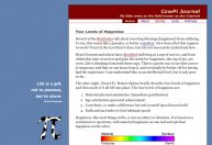
Well, it seems to be that time of year again when I remodel the ol’ weblog. Welcome to CowPi version 3.0! The colors are a bit bold for my personality, but hey, I’m trying to expand my boundaries. Hope you like them? I have also used some fancy CSS tricks, but those under the hood, so to speak. I wish there was a method to get away from the rectangular format, but that seems the most efficient way to pack a lot information into a browser window.
You can view the old versions by clicking on the images at right. This year’s model went back to a traditional weblog format with a sidebar containing a massive amount of links. I added the sidebar for several reasons. One, weblogging is partly about community (just like faith in Jesus), and links to other weblogs help build a sense of that community. Besides, I got tired of waiting for another page to load that just contained a bunch of links. Two, lately I have noticed myself looking through other weblogs’ sidebars looking for new things to read. Three, there are a bunch of little extra things that can be added in the sidebar.
Some features of the new version: unvisited links are purple, and visited links are green, except for links in the horizontal menu and sidebar. A green check mark should appear next to visited links within the sidebar. There are two ways to get to the permanent link for a post, either by the post title, or the little πλ link. (πλ are the Greek letters pi and lambda—pi lambda, permanent link. Get it?) I also added a generous Creative Commons license to cover the minimum of rights I wanted to retain.
There are a few other things in the works. I plan to rotate through different quotes at the top of the sidebar, and maybe rotate the subtitle. Maybe a recent comments list. I also need to work in my cowpi logo into the design. Not sure where to place it.
If your browser displays something that looks messed up, please email me.

